R学习5-Graphics
Made by Mike_Zhang
所有文章:
R学习1-基础
R学习2-I/O
R学习3-Vector List Matrix
R学习4-Data Frame
R学习5-Graphics
1 Introduction
plot function:
1 | |
1.1 High-level graphics function
start a new graph, initialize graph window.
plot(): Plot function;
boxplot: create box plot;
hist(): create histogram;
qqnorm(): Quantile-quantile(Q-Q) plot;
curve(): function graph.
1.2 Low-level graphics function
cannot start a new graph, add something to the graph, based on the High-level graphics function.
points(): add points;
lines(): add lines;
abline: add a straight line;
segments(): add line segments;
polygon(): add a closed polygon;
text() add text.
Call High-level graphics function first, then call the low one.
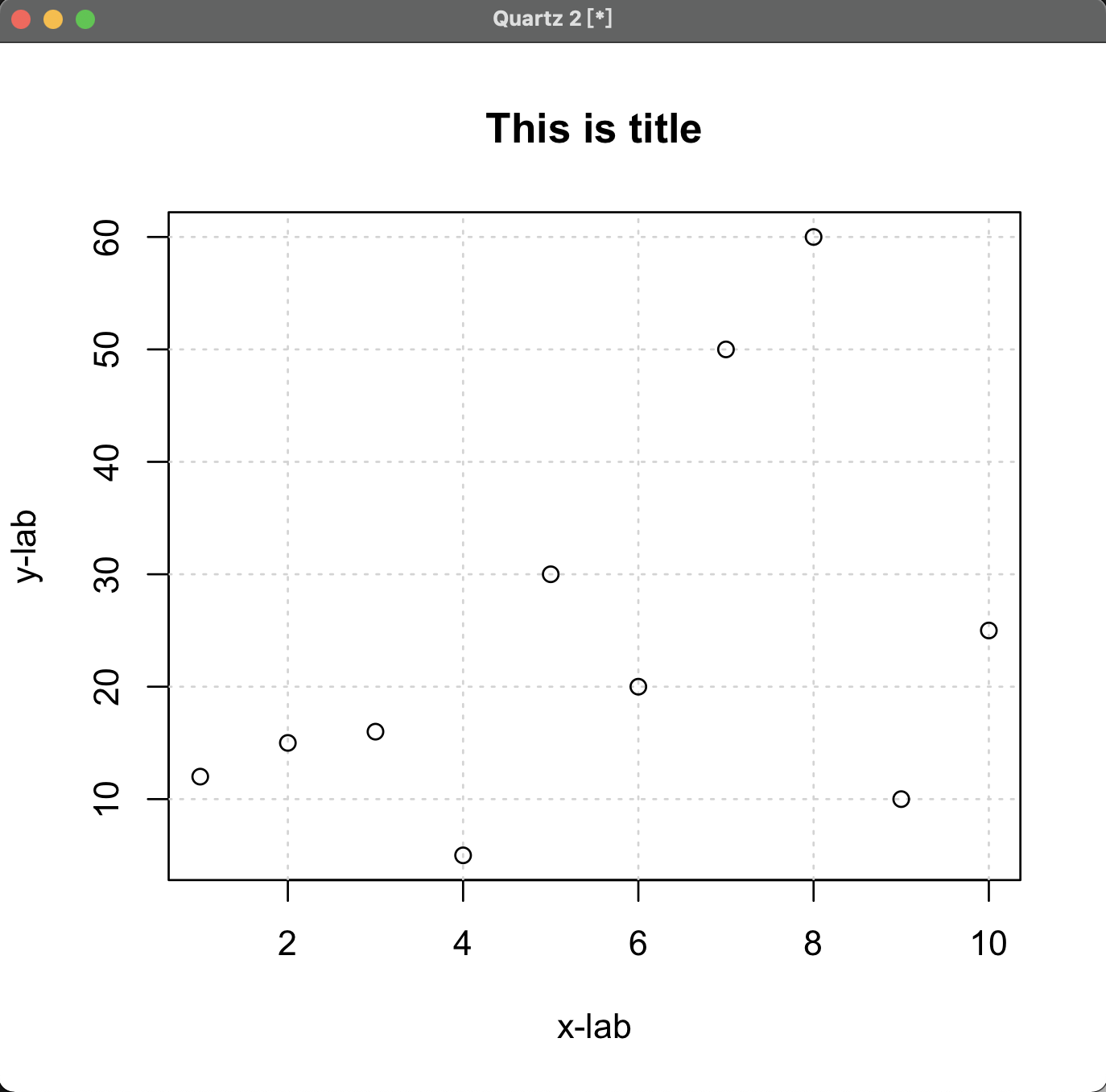
2 Title & Label
Parameter:
main: set title;xlab: set x-axis label;ylab: set y-axis label.
1 | |
OR1
2> plot(dfrm,ann=False) # ignore the annotation first
> title(main='This is title',xlab='x-lab',ylab='y-lab') # use title() to set
3 Grid
- set
type="n"inplot()function to hide the graph;- use grid() function to show the grid;
- use low-level functions to draw the graph again.
For example,
1 | |
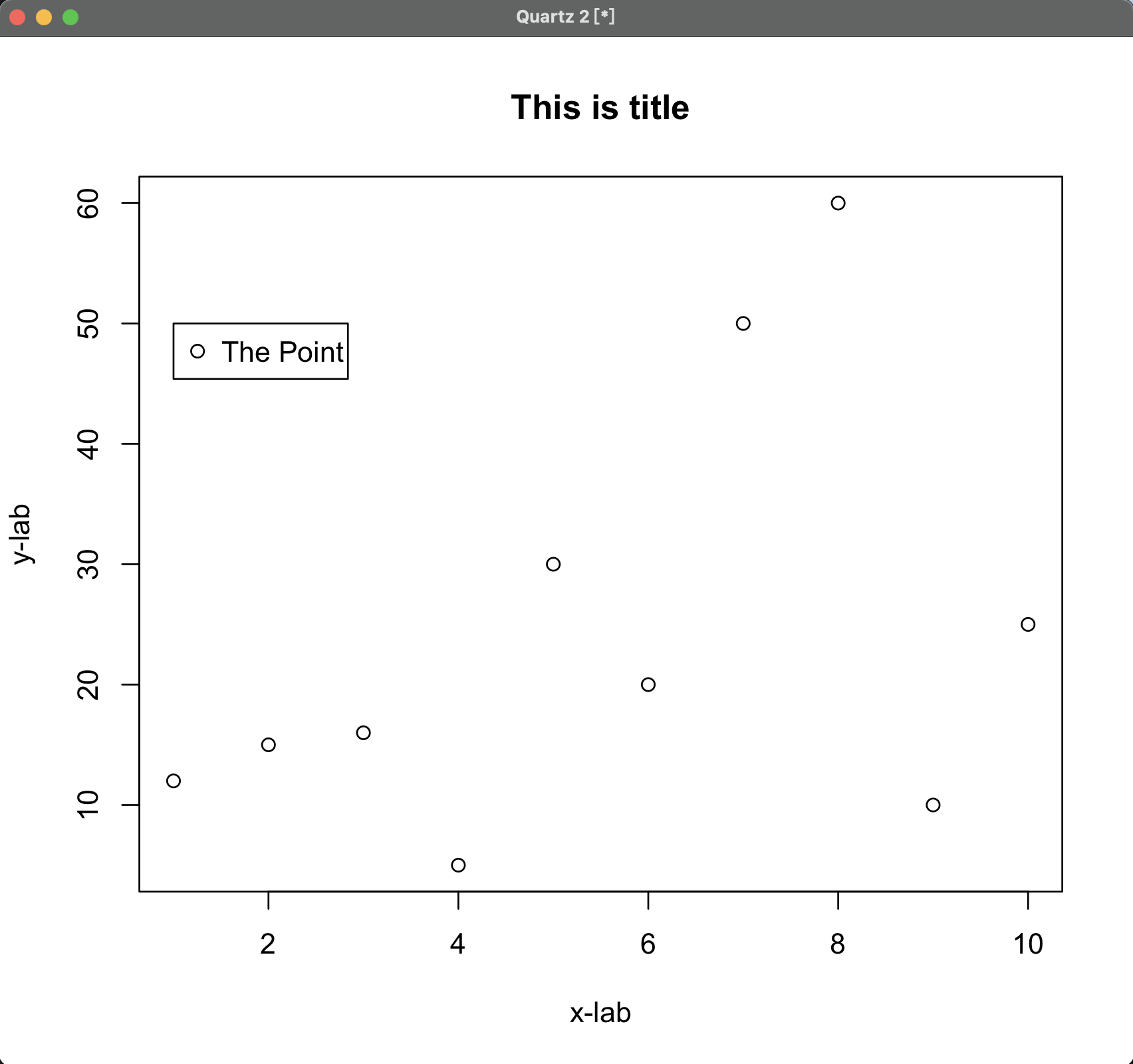
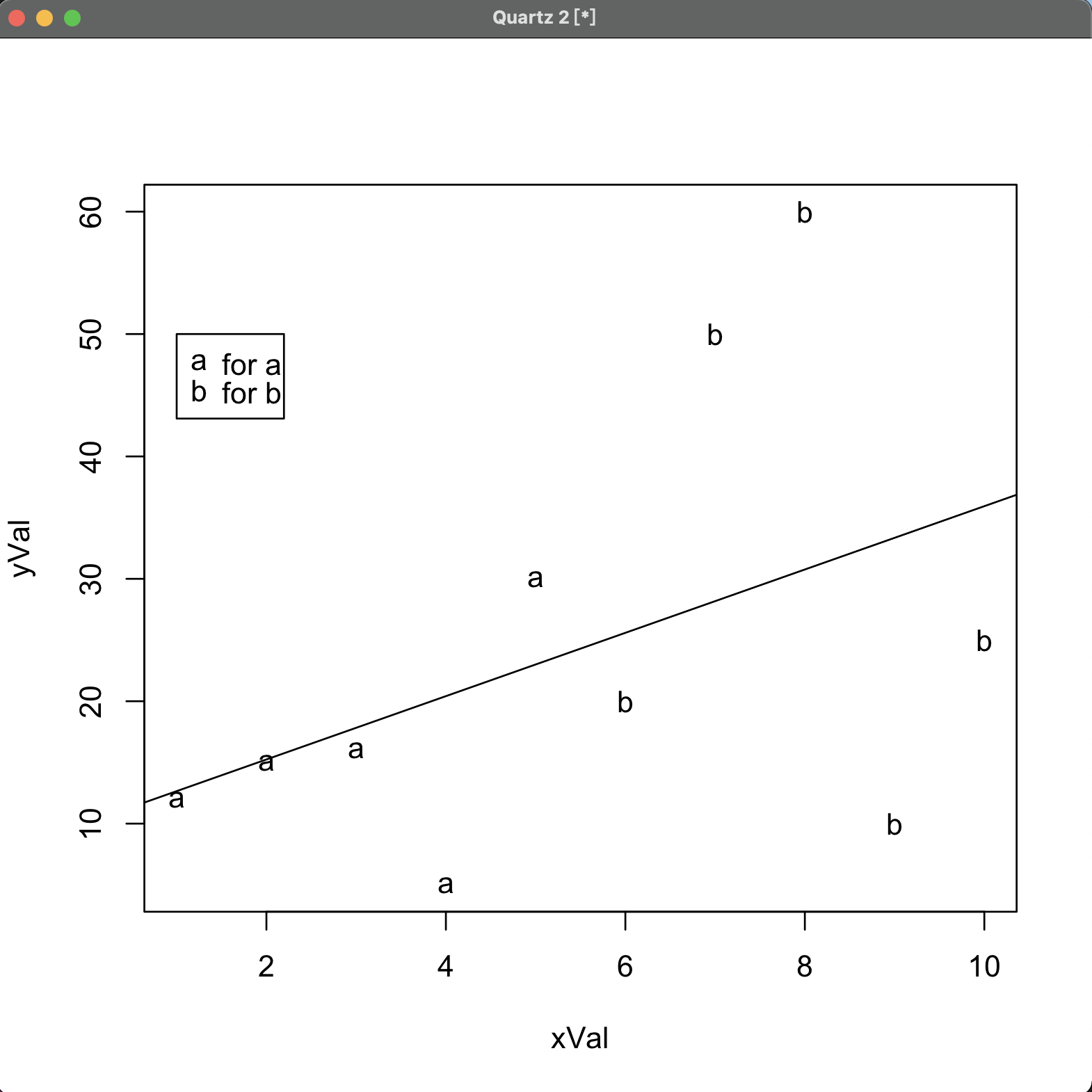
4 Legend
legend function:
1 | |
x, y: coordinates for legend box (top-left corner);label: vector of characters of legend;
last argument: based on which species.
For example,
1 | |
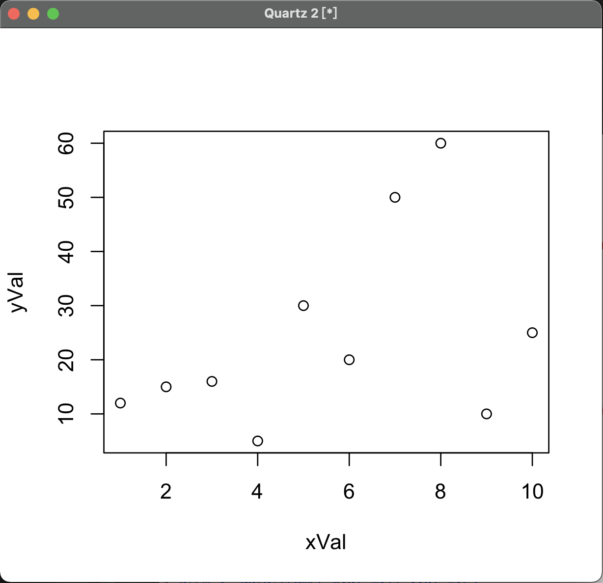
5 Scatter Plot
1 | |
x,y: two parallel vectors.
1 | |
dfrm: a two column data frame.
For example,
1 | |
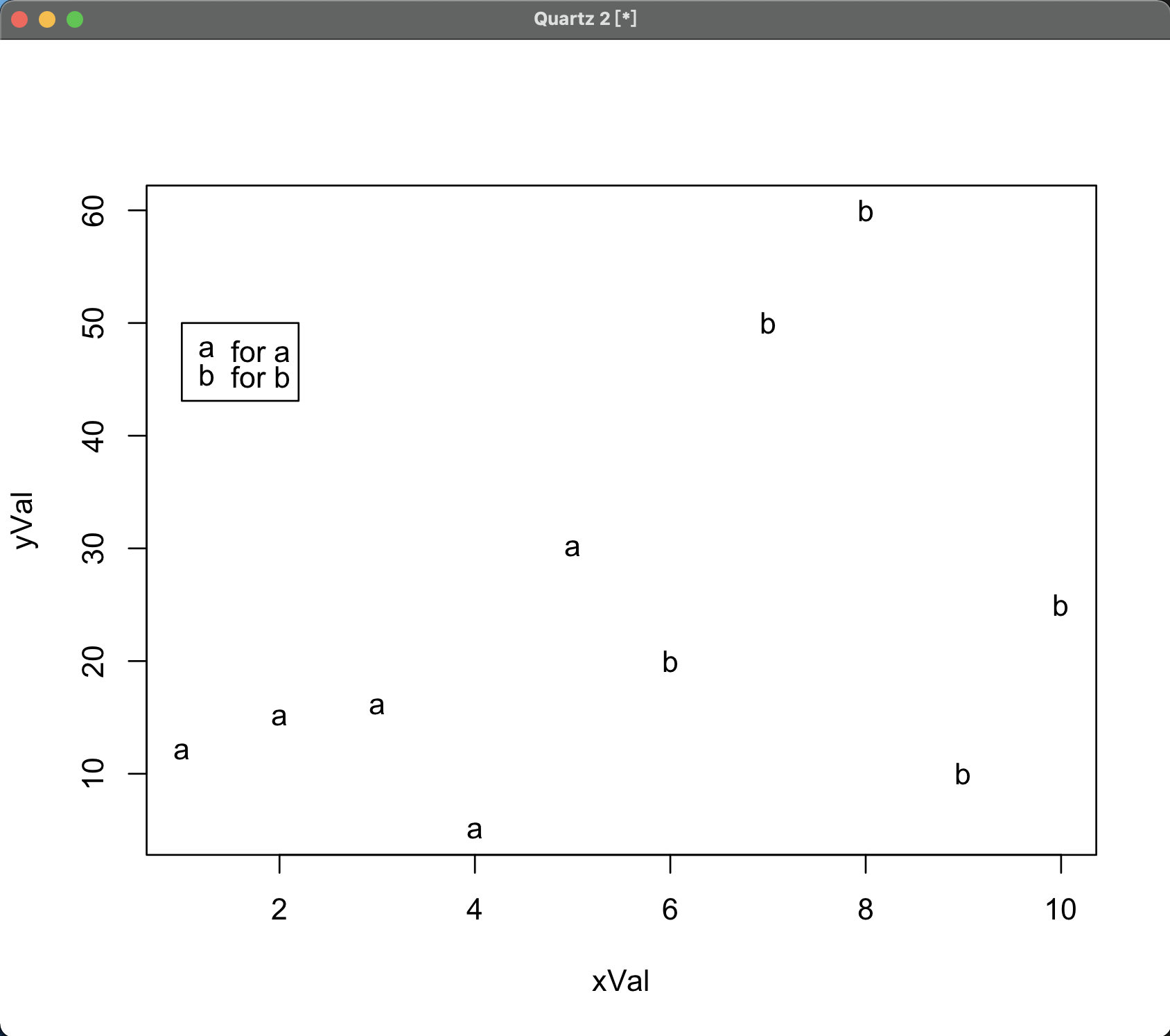
5.1 Multiple-Group Scatter Plot
Set pch parameter in plot() function:
1 | |
Example
1 | |
5.2 Regression Line of Scatter Plot
Use lm() and abline() function:
1 | |
For example,
1 | |
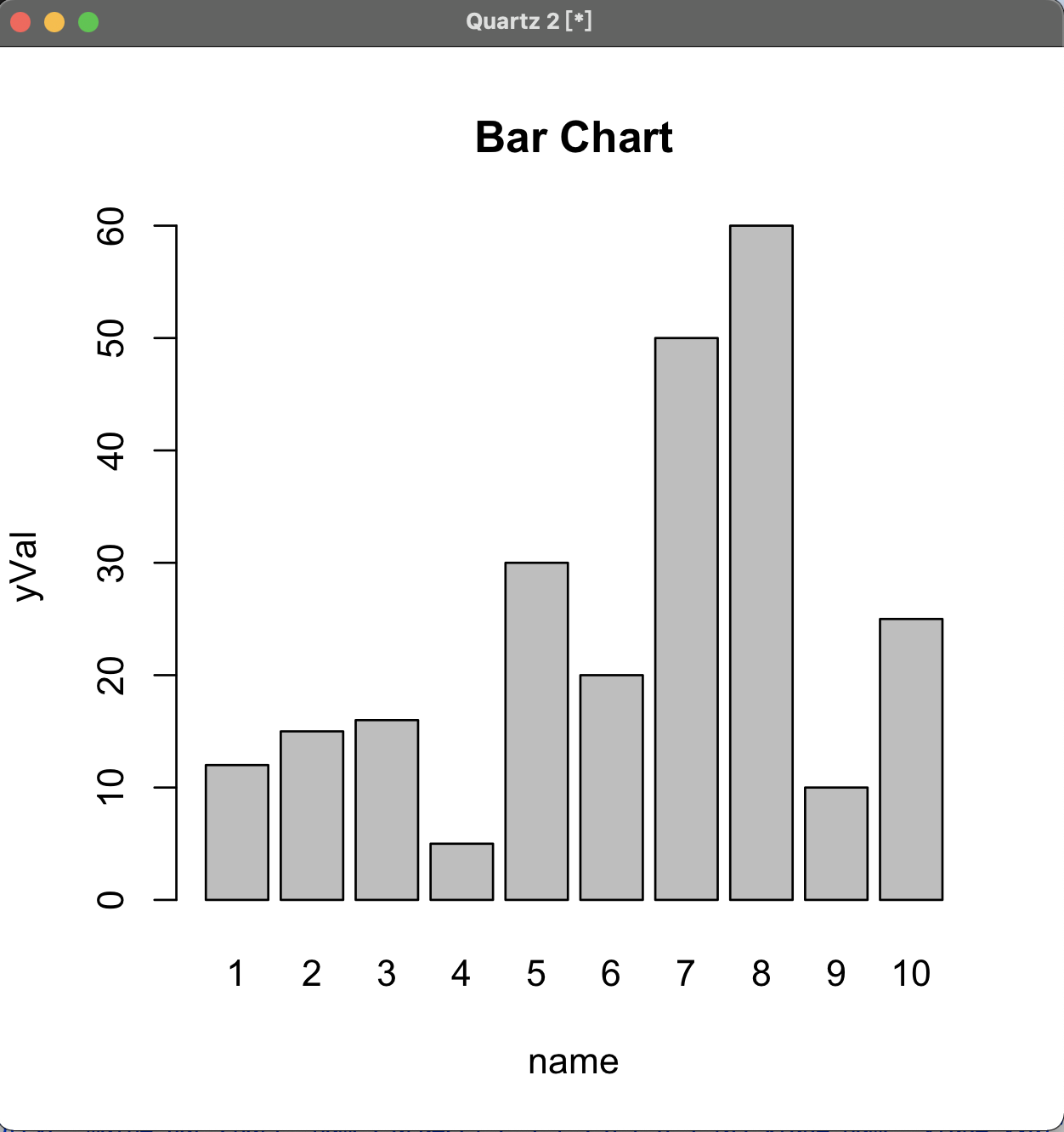
6 Bar Chart
barplot() function:
1 | |
For example,
1 | |
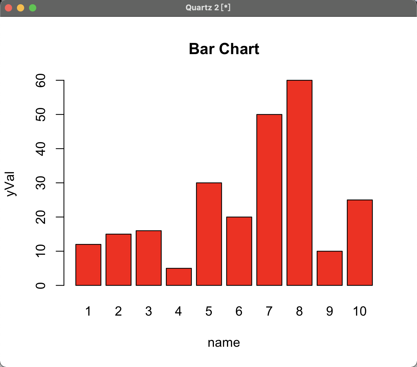
6.1 Coloring
col parameter of barplot() function:
1 | |
For example,
1 | |
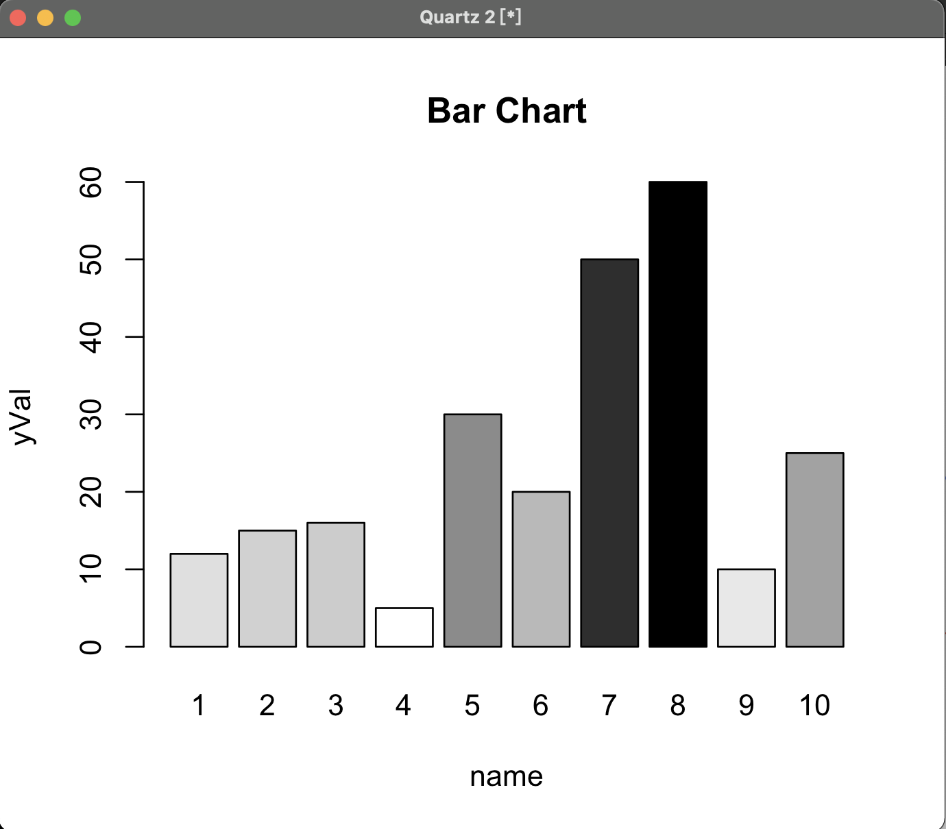
Colour based on the data of graph:
1 | |
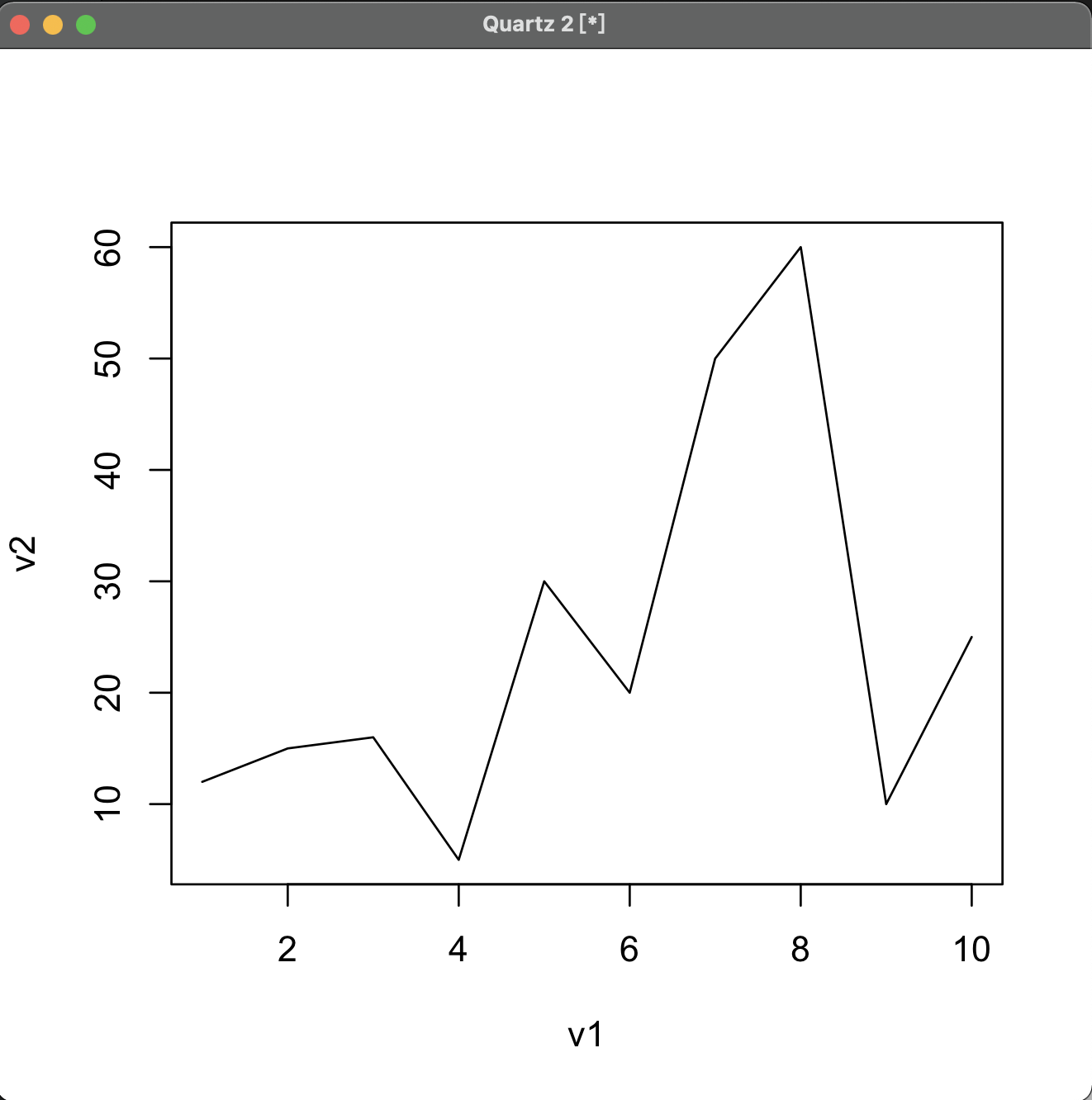
7 Line
Use plot() function:
1 | |
7.1 Line Config
Appearance of the line:
1 | |
Width of the line:
1 | |
Colour of the line:
1 | |
7.2 Multiple Line
Use xlim and ylim to set the interval of graph first.
1 | |
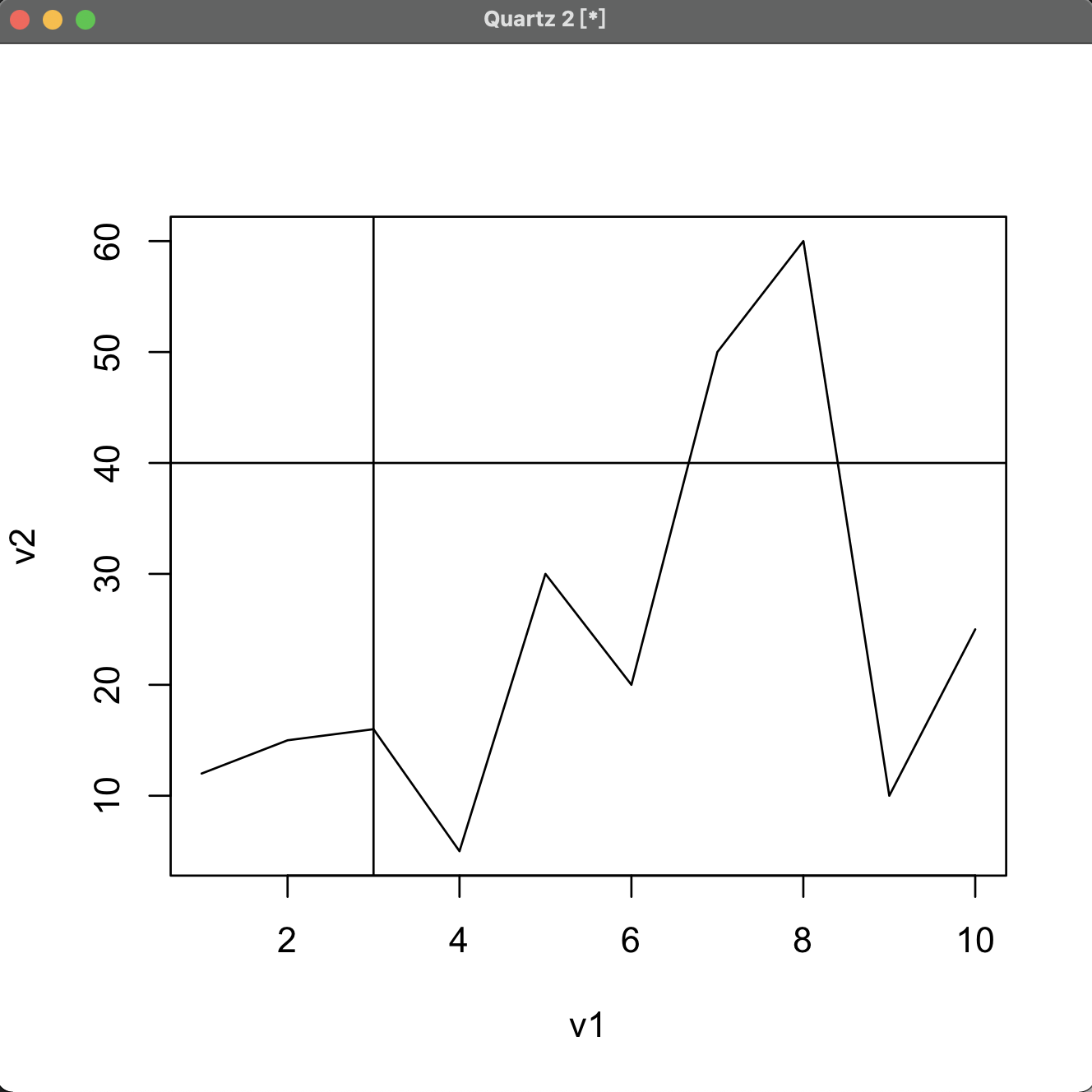
7.3 Vertical & Horizontal Line
1 | |
For example:
1 | |
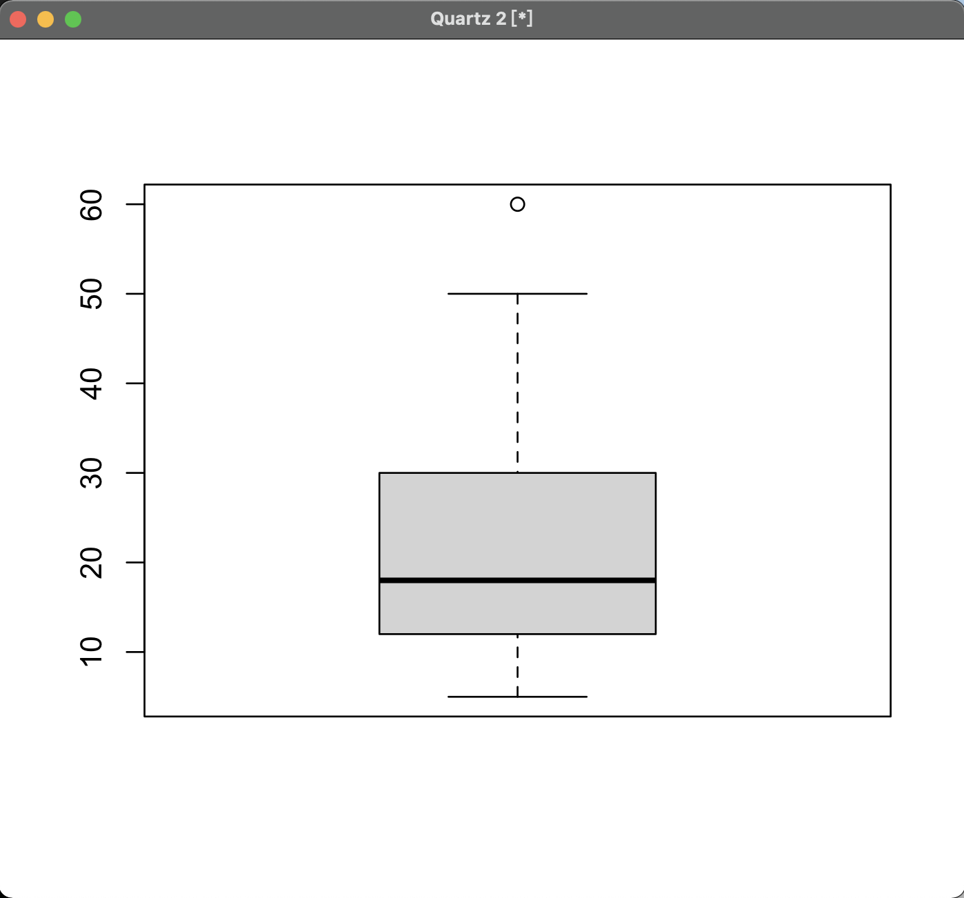
8 Box Plot
1 | |
For example,
1 | |
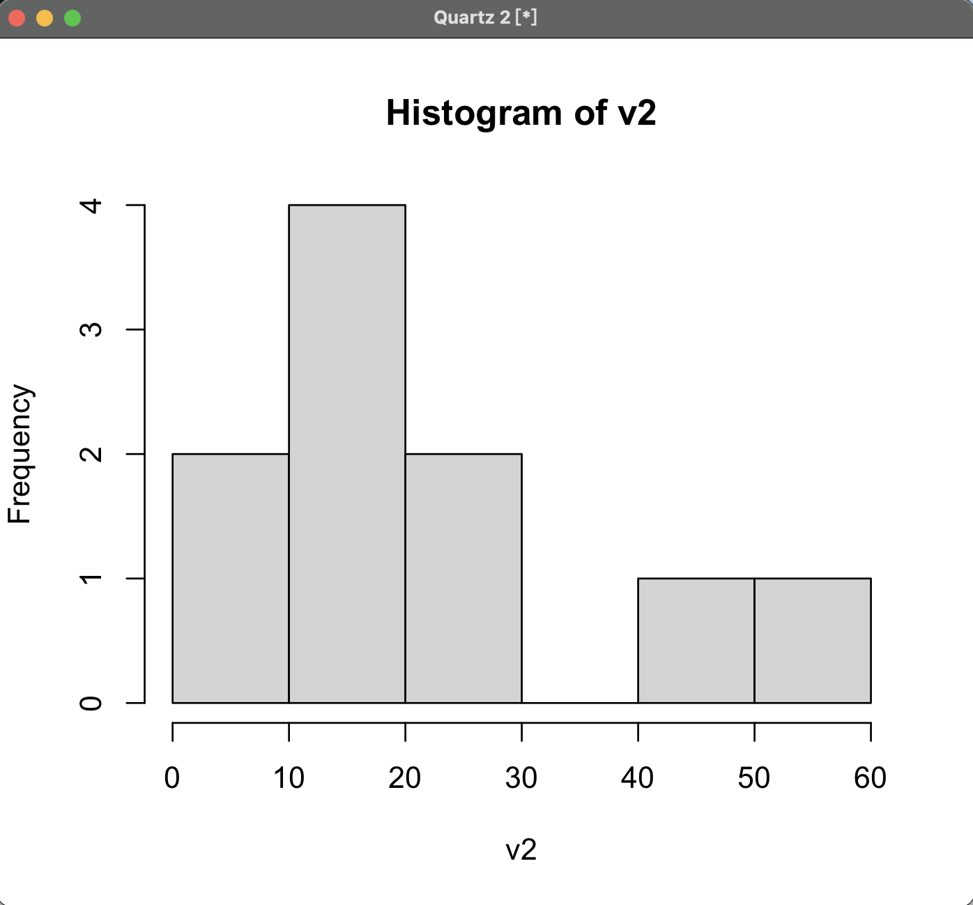
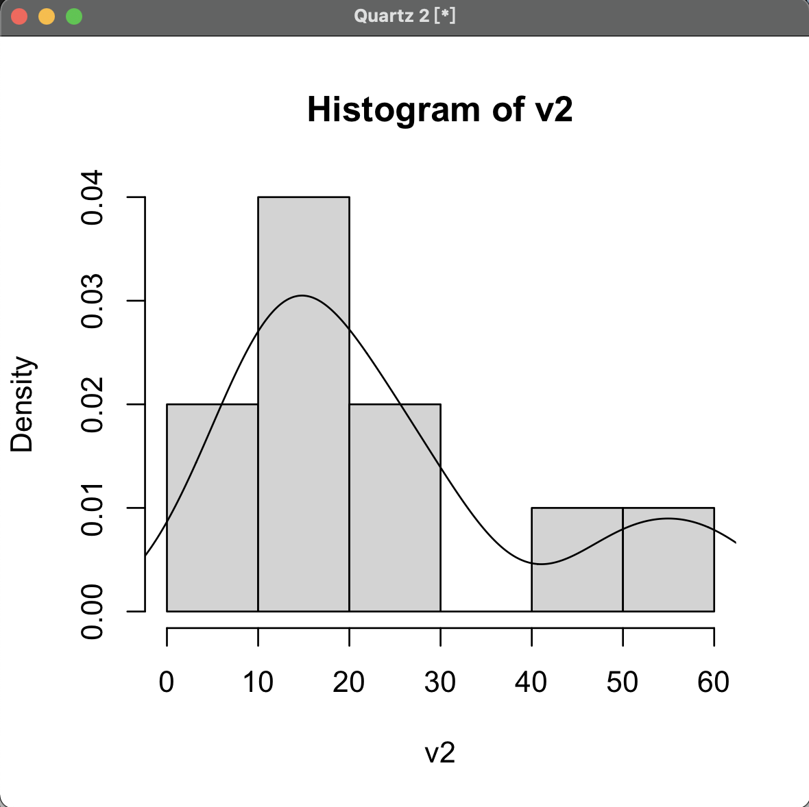
9 Histogram
1 | |
For example:
9.1 Density Estimated Line
Use the density() function:
1 | |
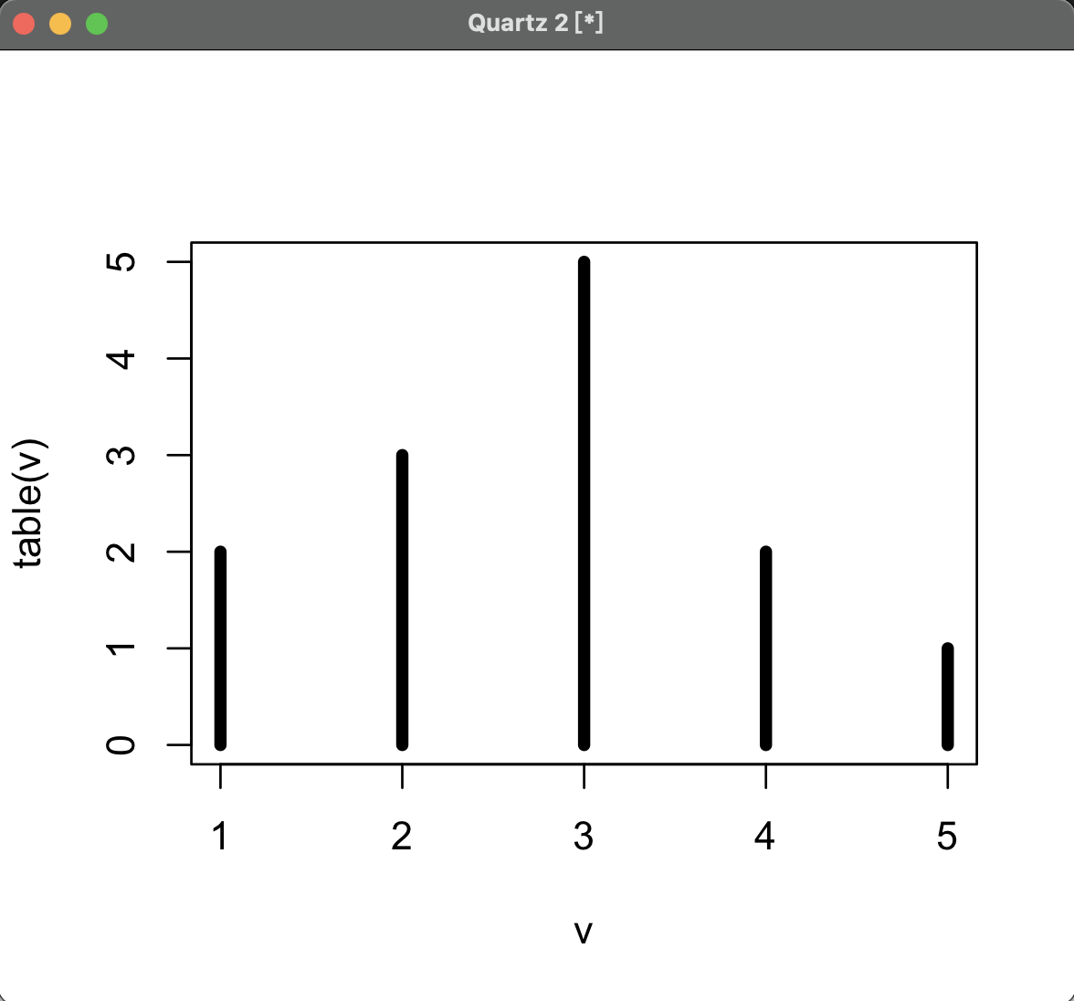
9.2 Discrete Histogram
Use plot() function and set type parameter.
1 | |
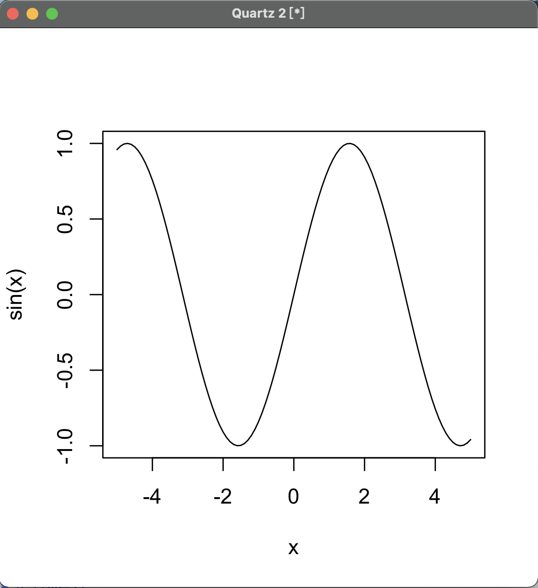
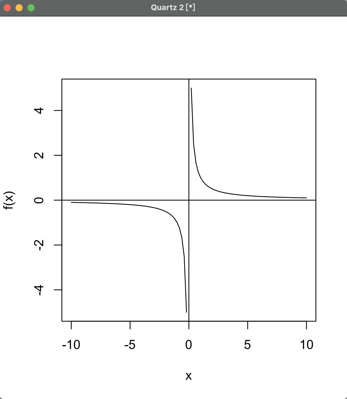
10 Function Graphics
Use curve() function:
1 | |
OR
1 | |
11 Plot Display
Set mfrow parameter to divide the window into a Matrix,
then call plot() function to fill the window.
1 | |
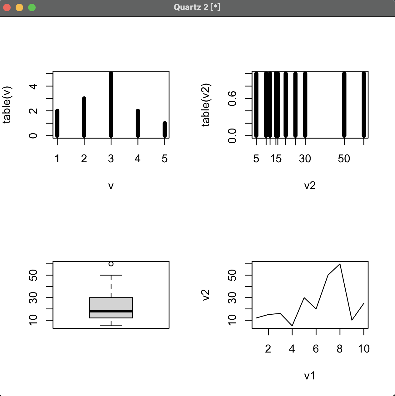
mfrowparameter fills window row by row, whilemfcolfills column by column.
参考
P. Teetor, R Cookbook. Sebastopol: O’Reilly Media, Incorporated, 2011.
写在最后
R语言相关的知识会继续学习,继续更新.
最后,希望大家一起交流,分享,指出问题,谢谢!
原创文章,转载请标明出处
Made by Mike_Zhang